Leia Bell

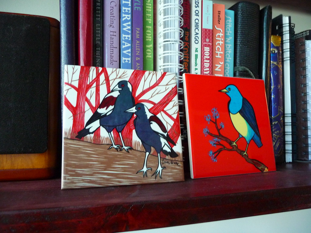
This was the booth I purchased from, and pretty much knew I had to purchase from because of an awesome poster of a Roller Derby girl. Also adorable cats. And somewhat impulsively, I bought the two tiles of birds as well. If I had to list some of my favorite things, that nearly covers it. Her booth displayed both gig posters and art prints. Which helps with the typical issue I have at Flatstock, that the artwork and the band it represents don't always show up in the perfect combination (I'll like the art a lot but not really want to have a poster for a band I'm not so much a fan of.) And she had a bunch of great impulse buys on her table like tiles and magnets, and the size of this work wasn't quite as large as some of the other booths, which hopefully will mean it's a little easier to find a place to hang it.
She's from Salt Lake City where she got into the business of making gig posters by befriending the owner of a local venue, Kilby Court. She's now married to that friend and lives with "three young sons (Cortez, Ivan and Oslo), an all-ages music venue, a printing studio, a wood shop, two dogs, an evil cat, a modest house, a few scattered ailanthus trees, and a soccermomish minivan all on the same street, Kilby Court."
Crosshair Design


This was another favorite, and a local, based out of Chicago. His work features "anti-monuments" with the band names subtly on the buildings as if they were painted on the buildings years ago. Unfortunately it was a case of the artists not quite matching up with the artwork I preferred. While there were art prints available, they were out of reach as far as price, and I really like the text as an element in this work. I was most leaning toward the Magnolia Electric Co. Poster, since I like the band. The blue building was a factor I was indecisive about..I liked it since blue is a favorite color of mine, and thought it made that print a little more playful than the others, but overall I really liked the maturity of this work, and though perhaps one of the prints with more muted tones was more representative.
Mat Daly

I loved this print! It was a bit pricey for what I was willing to spend right now, but perhaps once I've figured out where some of the other art goes I will get it eventually. Mat Daly is also based out of Chicago, so hopefully that means I will see some of his work around town. The work is full of overlapping shapes, but I particularly like this image with the owl, and the fact that it's a poster for the renegade craft fair doesn't hurt either!
These were the big three booths I was considering this year. One of these days I will find the perfect print from Diana Sudyka (almost bought one of a crane this year, but decided it was a little too large. But the colors in her work are even more gorgeous in person.) I also really liked the intricacy of work by landland, an artist I don't remember seeing at last year's Flatstock. And it was nice to see The Small Stakes and Powerslide Design Co., from whom we purchase prints last year! Actually, there was no shortage of good work, and I think just about every booth had something in it we liked. I think I'm glad Flatstock only happens once a year.
No comments:
Post a Comment